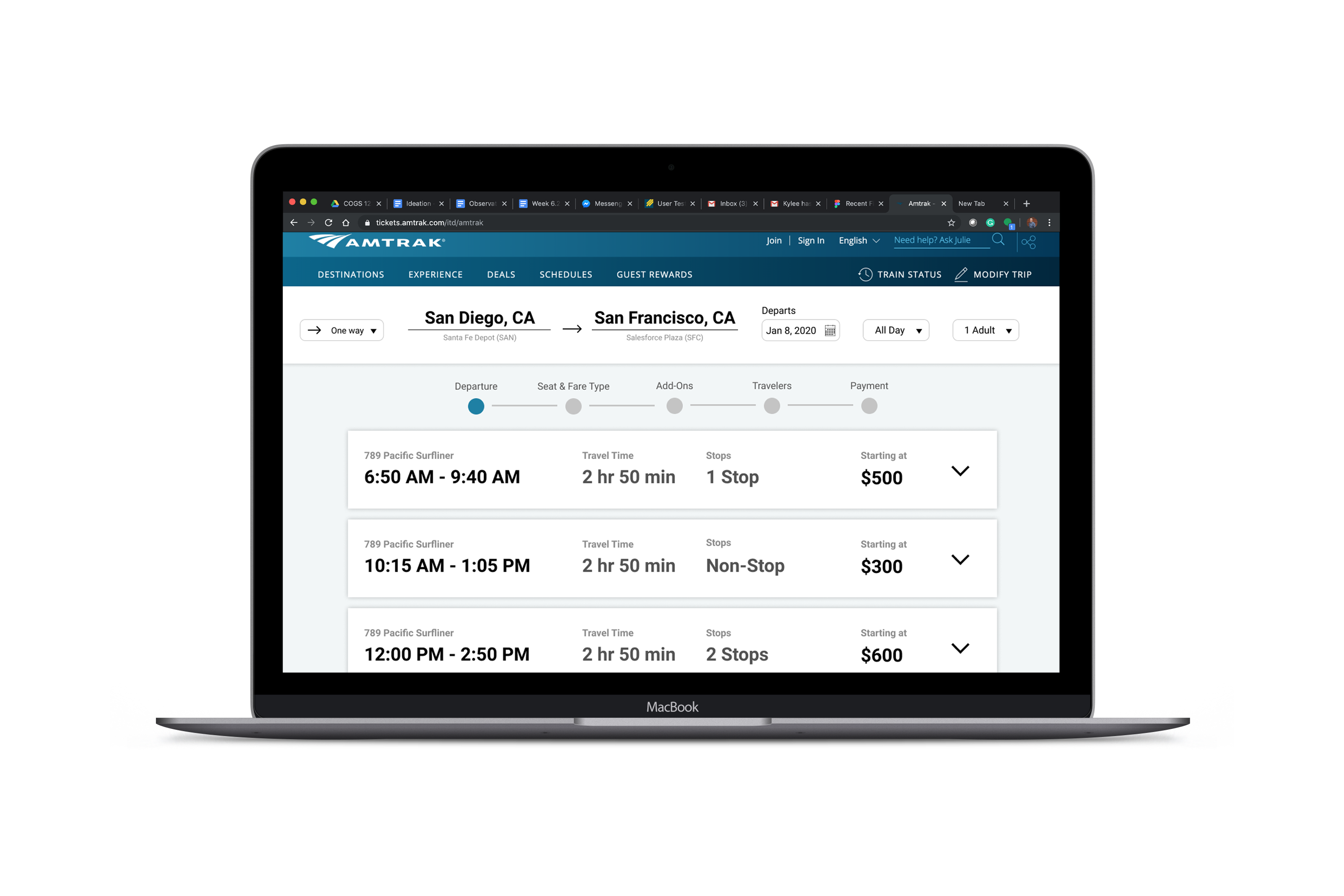
Understanding Amtrak's Current Design
Empathizing with train riders' frustrations
We interviewed students from different hometowns to perform a few
tasks on the Amtrak website. We noticed that most of them struggled
with similar parts:
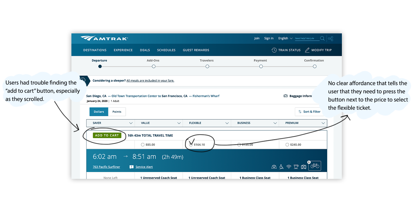
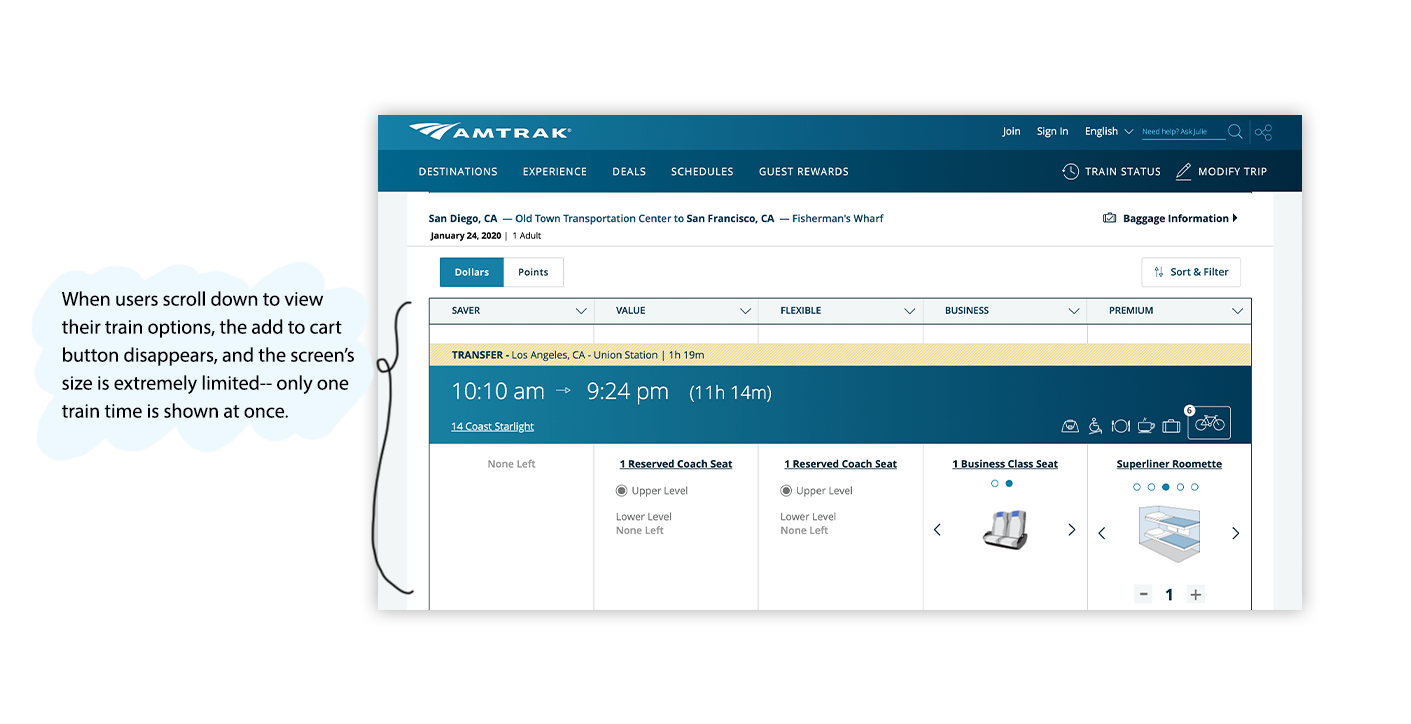
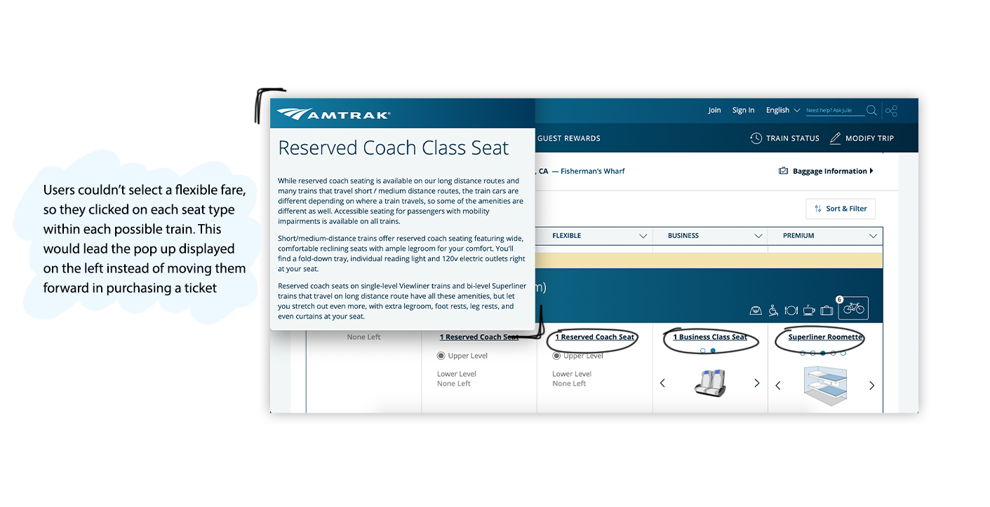
- Users couldn't find where to book special ticket types
- Users didn't correctly select the right fare type for each train
- Users took a while to identify how to proceed once they selected a train time.
The Solution
Distinguished Steps & Intuitive Ticket Booking
My partner and I focused on improving the discoverability of all
the different types of ticket options available, and separated the
overwhelming amount of options into digestible steps.
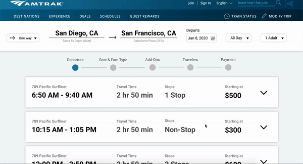
Our design incorporates:
- Clear & accessible display of trip information
- Breadcrumbs that indicate user's progress until
successfully booking a ticket
- Clear visual hierarchy between fare and seat options
- Visible prices
- Noticeable call to action to proceed to next step
- Dropdowns reveal more details about a specific route
- Clear distinction between different options
Future Plans
I would conduct more tests to see if our redesign improved, and
continue to iterate on making our design more intuitive and
straightforward to use. I would also like to conduct more tests
on a more general user base to better understand the average user.