Understanding Brown Paper Tickets
Examining the current design
We interviewed a few UCSD students about their experiences with
purchasing event tickets and asked them to try out Brown Paper Tickets.
We compiled the top three usability errors that
our users had when performing simple tasks.
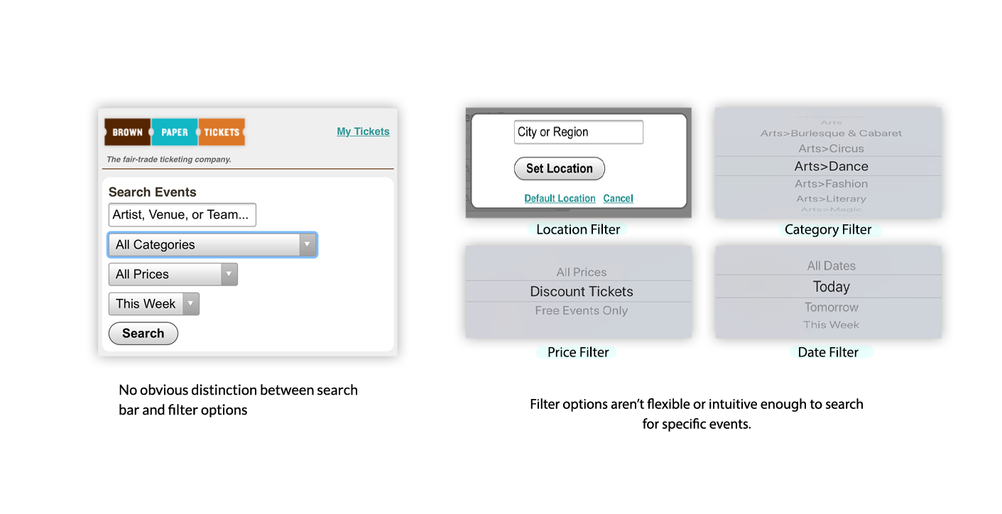
Filters were difficult to use
Users had trouble filtering through specific dates, locations,
prices, and event categories.
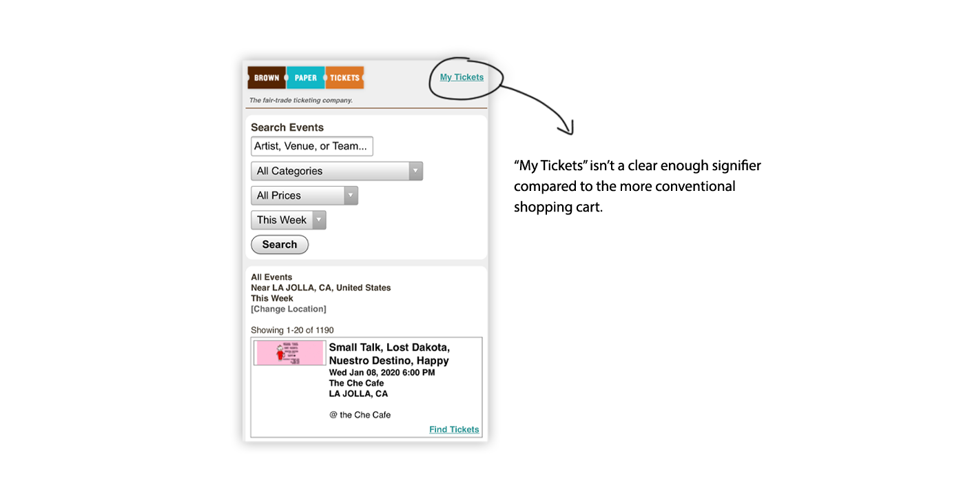
Shopping cart is hard to identify
Users couldn't navigate to their shopping cart to find tickets.
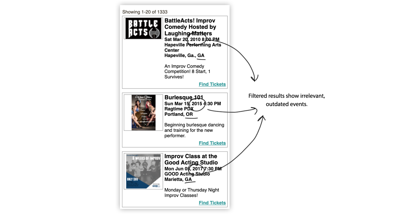
Filters weren't functional
The filters would reset, making users scroll through
every listed event to find the correct one.
The Main Issue: Searching & Filtering
We decided to redesign the search bar and filter options.
All of our users struggled with searching and filtering to
find specific events.
Ideating
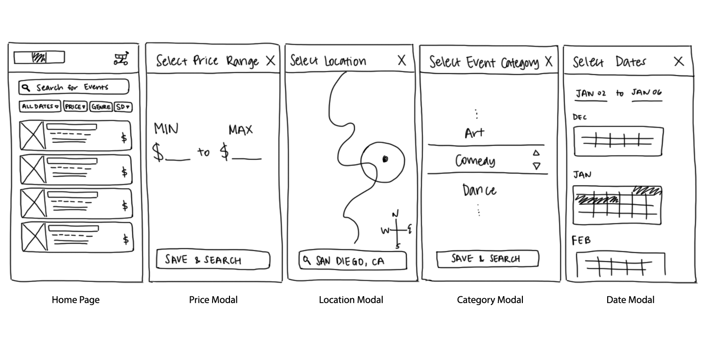
Low-fidelity wireframes
We started off by sketching out different ways to make the searching
on Brown Paper Tickets more intuitive and easier to use. Below are
my sketches, where I focused on making each filter easier to use.
Prototype
A More Enjoyable Event Finding Experience
We combined the best ideas from our low-fidelity sketches and began
prototyping. We created two high-fidelity prototypes, one of which
promotes event browsing, one of which highlights the many filtering
options. I primarily focused on prototype 2, but make sure to give
the
first prototype
some love!
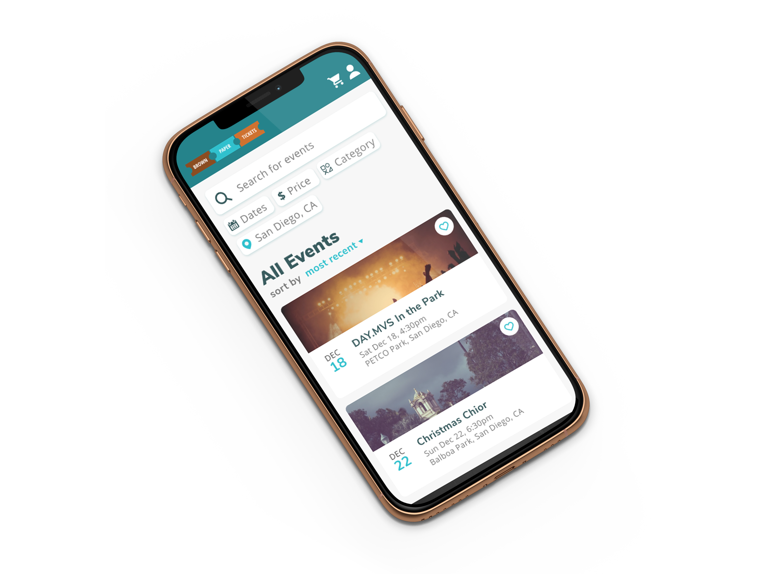
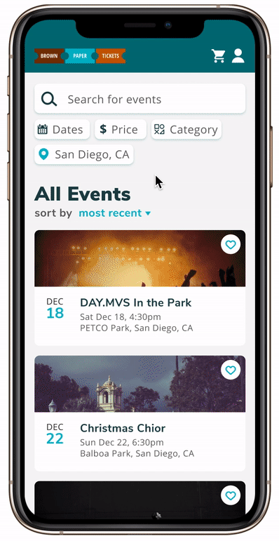
To simplify the searching experience, we put both the search bar
and all the filtering options on the home page. There's also a
sorting button to sort the displayed results based on the user's
preference.
User Testing
Did our prototype resolve the difficult searching experience?
We interviewed four new users to use our prototype and isolated some major strengths and weaknesses:
Strengths:
- Intuitive and straightforward flow
- Filters were easy to apply
- Convenient to use
Weaknesses:
- Price isn't displayed on the event cards
- Users wanted more guidance on the search bar
- Lacked sorting features
- Missing "clear filter" function
Learning & Future Plans
Based on user testing, we would make the following changes:
- Display starting prices for each event on the event cards
- Instead of “Search for events”, include an example search on
the search bar such as “Comedy Show” or “December Nights”
- Include other sorting options for the results
- Include a “Clear All” button for the filters
From this project, I learned that it's important to ask questions
during testing. A lot of users aren't used to explaining the
thoughts behind their actions, so it's helpful to constantly remind
them and ask them what they're thinking about. I also realized that
all users are unique and have different ideas than we do.